JP's HUD mod
A downloadable mod
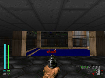
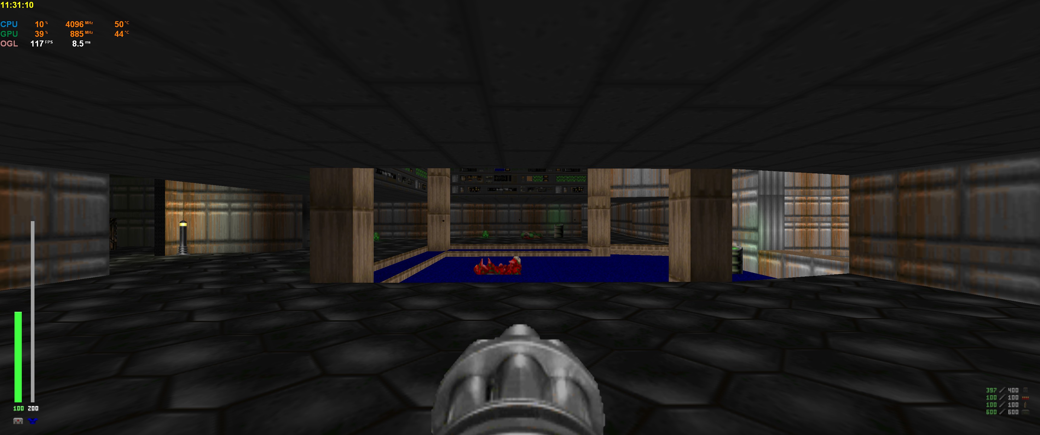
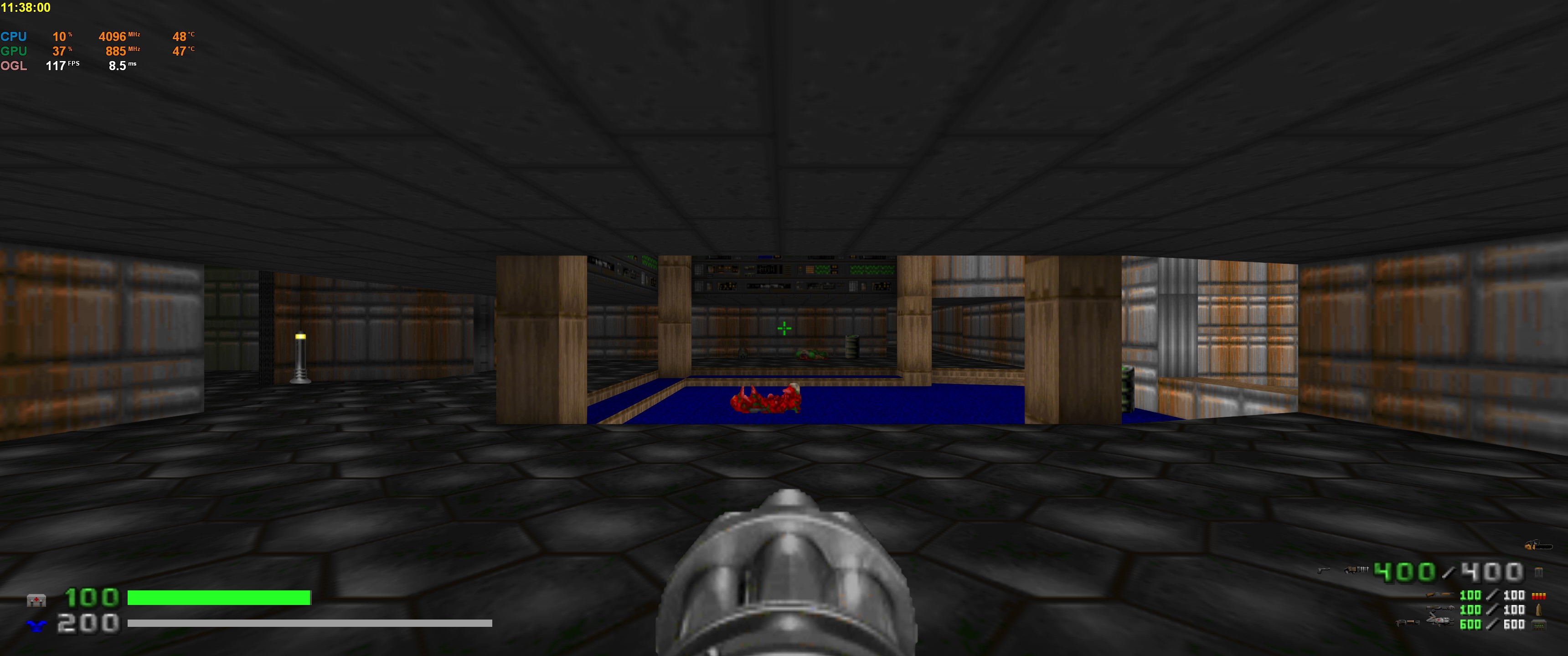
This is a basic HUD mod for GZDoom 3.0 or later. It emphasizes readability while conserving screen space. Vertical health and armor bars should make it easy to tell how much health you have in your peripheral vision without glancing at numbers.
Configuration options described in the included readme.
| Status | Released |
| Category | Game mod |
| Release date | Jul 27, 2017 |
| Rating | Rated 5.0 out of 5 stars (5 total ratings) |
| Author | JP LeBreton |
| Tags | Doom, FPS, gzdoom, hud, mod |
| Content | No generative AI was used |
Download
Download
jphud-doom-mod.zip 6.8 kB
Version 3 Nov 18, 2021
Development log
- update: kill/item/secret counts become gold-colored if at 100%Nov 18, 2021
- update: fixed ammo display with mods that use custom fontsNov 03, 2020
- update: fix rare crashSep 01, 2020
- update: K key now cycles stats/time displayJun 15, 2020
- updated with a fixSep 03, 2019
- new versionJan 21, 2019

Comments
Log in with itch.io to leave a comment.
thank you. Could i change сolor of Ammo counter and Health counter? I would like Numbers have red color
Hey, JP. I don't know if you're aware but custom intermission fonts can mess up alignment in the ammo tally. You can check BTSX or Eviternity, for example.
Thanks for reminding me, I released a fix: https://jp.itch.io/jphud-doom/devlog/192895/update-fixed-ammo-display-with-mods-...
Cool!
Would it be possible for this to work with SmoothDoom? It cuts off the ammo display and weapon models on the right side of the hud. I tried looking into fixing it myself but since this is made with zscript I have no idea what I'm doing lol, will be willing to donate something like 25$ if you could make a patch or tell me how to fix it :)
Edit: loading your hud before SmoothDoom makes it not load at all and loading it after causes the issue mentioned above. AFAIK SmoothDoom makes some changes to the SBARINFO
I can't seem to reproduce this issue with a fresh config (gzdoom.cfg) when I load SmoothDoom first and then JPHUD - the ammo display always draws near the right edge of the screen with no cut off, no matter what aspect ratio or scaling factor I choose.
FWIW the version of SmoothDoom I have is the latest one in this thread: https://forum.zdoom.org/viewtopic.php?t=45550
Hi.
I tried with a clean config file and while I can see the ammo display on the right, I cannot see the weapon models/sprites next to it that is present without SmoothDoom. See attached image - I am running the latest version of GZDoom, SmoothDoom and JPHUD loaded last with a clean file in ultrawide 3440x1440 resolution
 Last image with is what I have it setup to look like without SmoothDoom, with the weapons and larger ammo display for the selected weapon shown properly
Thanks, I'll look into this.
Cheers :) looking forward to a potential fix, your hud is my favorite I've come across and along with SmoothDoom is the 2 is must-haves for my vanilla playthroughs
Okay, try loading this pk3 instead of the main release jphud.pk3: https://www.dropbox.com/s/tzl1lh9fpmbbxaz/jphud_smoothdoom.pk3?dl=0
Smooth Doom defines its own custom weapons so the player doesn't have the ones that my HUD was expecting. I generalized it a little bit, but only just enough to make this custom version of it.
It is objectively the most comfortable hud for Doom. Thank you very much! Only one inconvenience - indicating armor type. Armor indicator, somehow, shows green armor if it's below 100% even if megaarmor is equiped and, vice versa, shows blue armor if it's above 100% but regular armor is equiped.
Thanks, and good catch - I think my code for detecting the player's armor type is naive. I'll fix this next time I return to it.
Fixed: https://jp.itch.io/jphud-doom/devlog/98146/updated-with-a-fix
Just tested the mod and I love the idea! A great DooM HUD is always appreciated! thank you!
Can I make a few suggestions?
If the emphasis is on readability and keeping the information in the periphery, why not swap armor and health? Keep the least important information at the edges of the screen, and possibly make health slightly larger than armor.
Have the current ammo pool float to the top? Or place the ammo counts at the bottom of the screen (similar to Quake) with the current pool centred and in large font (similar to how Doom 3 places the ammo counter on the weapons).
Take a look at these cutom Quake Live huds. http://qlhud.net/author/R1per2
Is there a source code for this mod so we can make our own changes?
Hi, thanks for the suggestions and examples. I'm often tinkering with this so I'll update with any tweaks I like in the future.
This mod is made with ZScript which is only compiled at runtime, so the source is in the PK3 itself (zscript.txt in this case).